
Try Home Office Paint Colors on a Photo of Your Own Office
Upload a photo of your home office, describe the wall color in a sentence, and see dusty blue, sage or charcoal around your own desk, shelves and window before you pick up a roller.
Free account required. New accounts get 2 free renders (watermarked) in most countries, then paid plans.
Home Office Wall Colors Before and After
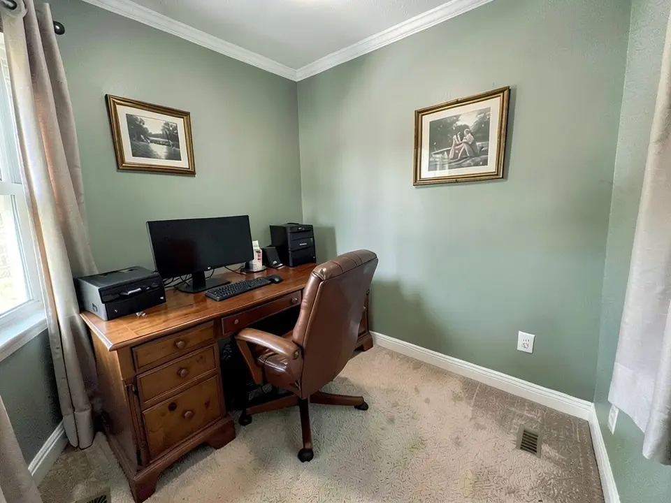
AI-generated sample edits. The before photos are AI-generated sample home offices; the camera angle and light stay the same and the wall color changes. Each caption names anything else that changed. A render shows a color idea, not real paint on a real wall, and real paint looks different under your own bulbs.
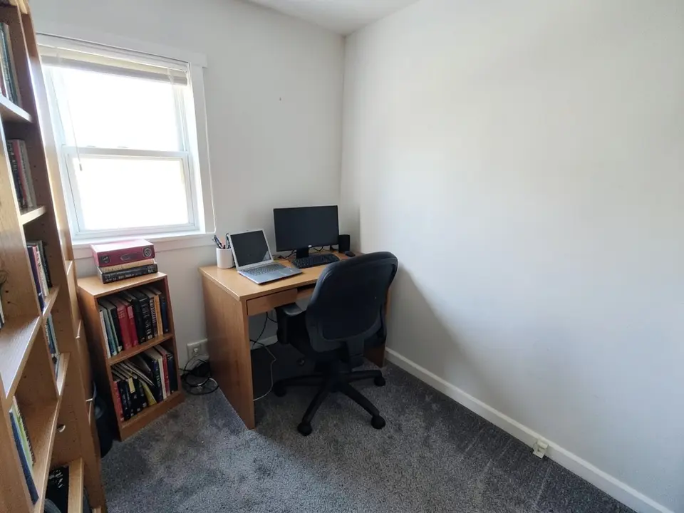 Before
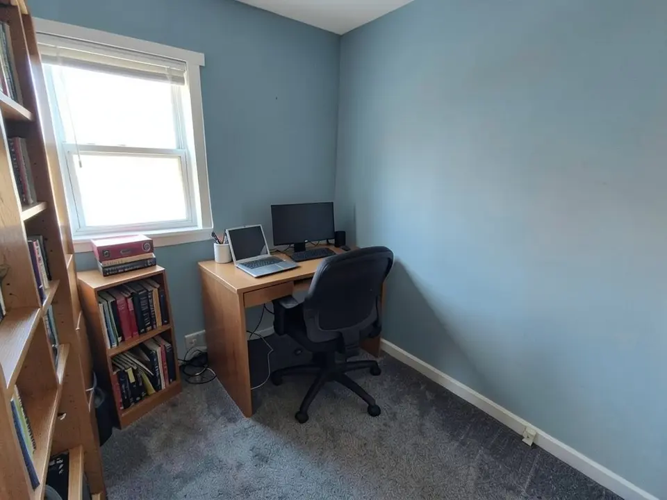 After
After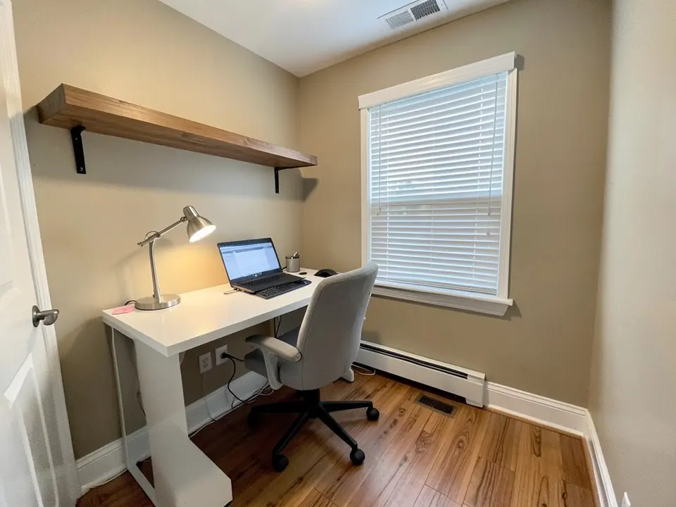 Before
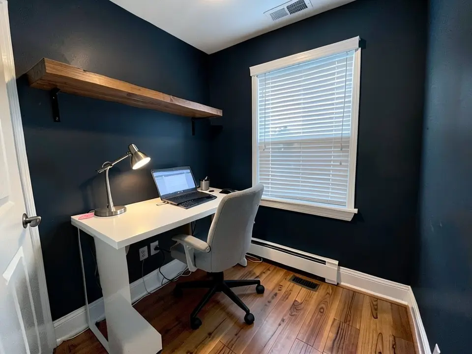 After
After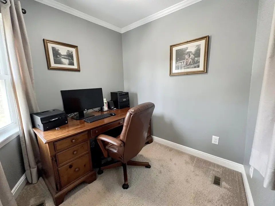 Before
 After
AfterHow to Preview Home Office Paint Colors on Your Own Photo
- Take a clear photo. Turn on the lights you actually work under, such as the ceiling light and the desk lamp, and shoot from a corner so two walls, the desk, the window and the baseboards are in view. Keep the lens level.
- Open the paint tool in Custom mode. Upload the photo and describe the change in one sentence: “Paint only the walls dusty blue. Keep the white trim, the ceiling, the desk, the chair, the shelves, the window and the floor exactly the same.” Name the trim, furniture and floor, because the AI can recolor or redraw them along with the walls.
- Compare two or three colors. Render a short list, such as a blue, a green and a gray, download the results and look at them on the screen you will decide on. Then paint a large sample on one wall and look at it at the times of day you actually work.
A home office has more to color than the walls. See the accent wall visualizer for one feature wall, the trim paint color visualizer for the baseboards, the interior door colors page for the door and the interior paint visualizer.
Home Office Paint Colors to Try
Blues and greens
Bob Vila says cool blue, such as Behr Watery, aids focus, and describes Behr Secret Meadow, a green, as tranquil and reducing eye strain. Sherwin-Williams describes Azure Tide, a blue, as grounding and tranquil and suited to intense focus. In our example, white walls went a dusty gray-blue.
Charcoal, navy and other dark colors
Sherwin-Williams describes Grizzle Gray as a dark, saturated charcoal with a strong, anchoring presence. Bob Vila describes Sherwin-Williams Inkwell, a black with a blue hint, as moody yet inviting and minimizing distractions. In our example, beige walls went a very dark navy-charcoal.
Gray-greens, greige and soft neutrals
Bob Vila says gray, such as PPG Silver Sage, makes spaces with little natural light feel lighter and more open. Sherwin-Williams calls Alpaca a warm, versatile greige and Rock Candy a white with whisper-light blue-gray tones. In our example, gray walls went a muted gray-green.
Warm and bright accents
Bob Vila describes Behr Surfboard Yellow as stimulating creativity and warns it may distract in conservative workplaces, and quotes Sarah Barnard saying creative fields welcome brighter colors and neutral tones are most versatile when in doubt. Benjamin Moore says energizing red or yellow accents can keep you alert.
Before You Paint Your Home Office
- Match the color to the work. Sherwin-Williams suggests calm soft blues or greens for detail-oriented tasks and more energizing hues for creative work.
- Think about light. Sherwin-Williams suggests lighter colors to brighten a dark office and softer tones to reduce glare in sun-filled rooms, and notes that layered artificial lighting changes how a color looks over the workday.
- Sample before you buy. Benjamin Moore recommends testing sample hues under your office’s lighting at different times of day.
- Look at the rooms next door. Benjamin Moore advises choosing colors whose undertones match or complement the colors in adjacent rooms, which it calls the “color flow”.
- Think about the camera. Bob Vila describes Downing Sand as a neutral backdrop for video calls.
- Check the details in the render. In our examples a laptop screen came out darker, a monitor changed shape, a chair and drawer fronts were redrawn, one wall picked up faint streaks and the floors and carpet were redrawn, so compare the render against your real room before you decide.
Home office advice here is drawn from Bob Vila (Mark Wolfe and BobVila.com Staff, published 2023-10-10), Benjamin Moore and Sherwin-Williams, which we opened directly. Benjamin Moore and Sherwin-Williams are paint makers, so weigh their advice accordingly. Claims about color and focus or productivity are the sources’ own, not ours, and the color names are theirs. This is general guidance, not a rule for your office.
Home Office Paint Colors FAQ
Is the home office paint color visualizer free?+
You need a free account to generate. New accounts in most countries get enough free credits for up to 2 renders, and free renders carry a small watermark. After that, paid plans on the pricing page give you more renders without the watermark.
Do I need to sign up?+
Yes. Rendering requires an account so your credits and results can be saved. You can sign in with Google or a one-time code sent to your email.
Can it change only the walls and keep my desk and shelves?+
That is the goal, and the best results come when you name the parts to keep, for example “paint only the walls dusty blue, keep the white trim, the desk, the chair, the shelves, the window and the carpet exactly the same”. It is an AI edit, not a mask, so check the result. In our examples the desks and chairs mostly looked the same, but floors or carpet were redrawn, one monitor changed shape, some drawer fronts and one chair were redrawn, and one laptop screen came out darker.
What is the best paint color for a home office?+
Sources differ. Bob Vila lists blues, greens, grays, greiges, a black with a blue hint and brighter yellows and reds, each with its own suggested use. Sherwin-Williams, a paint maker, says the best color is the one that makes you feel comfortable and productive. Benjamin Moore, also a paint maker, says the best color is the one that suits you, whether soothing or vibrant. Try a few on a photo of your own office and compare.
Can a dark color work in a home office?+
Some sources say yes. Sherwin-Williams describes its dark charcoal Grizzle Gray as having a strong, anchoring presence and supporting deep focus, and Bob Vila describes Sherwin-Williams Inkwell, a black with a blue hint, as moody yet inviting. These are the sources’ claims about their colors, not something our render can test. In our example a very dark wall made the room read much darker.
What color looks good behind me on video calls?+
Bob Vila describes Sherwin-Williams Downing Sand, a greige, as a neutral backdrop for video calls, and says Sherwin-Williams Rosemary, a green, is good for people on camera. Upload a photo taken from your camera angle and try both.
Will it show how the paint looks under my lights?+
No. The render shows a color idea. Benjamin Moore recommends testing sample hues under your office’s lighting at different times of day, so paint a large sample on your wall and look at it in the morning and in the evening before you buy gallons.
Sources
- Bob Vila: the best paint colors for your home office (Mark Wolfe and BobVila.com Staff, published 2023-10-10; designer Sarah Barnard quoted)
- Benjamin Moore: home office paint colors (a paint maker’s page: palette, undertones, sampling)
- Sherwin-Williams: office paint colors (a paint maker’s page: calming colors, neutrals, lighting)
Related Color Visualizers
- Interior paint visualizer – walls and whole rooms
- Accent wall visualizer – a feature wall behind the desk
- Trim paint color visualizer – baseboards and trim
- Interior door colors – the office door
- Cabinet paint color visualizer – built-in storage
- Match paint color from a photo – find a color you already like
See Your Home Office in a New Color
Upload one photo and compare a few wall colors before you paint.