
Cream Paint Colors, Tried on a Photo of Your Room
Ivory, buttery, warm white or soft beige: upload a photo of your living room, bedroom or kitchen, name the cream, and see it on your walls before you buy paint.
Free account required. New accounts get 1 free render (watermarked), then paid plans.
Try it on your own photo
Upload a photo of your room with the lights on. Name the cream and say that only the walls change and the trim, ceiling, furniture and floor stay exactly the same.
Cream Walls, Before and After
AI-generated sample edits of three rooms. The before photos are AI-drawn stand-ins, not photos of real homes; the camera angle and light stay the same and only the paint should change. All three were rerun: the first tries came out too yellow, so we asked for an ivory cream much closer to white. Even those still lean slightly yellow. The captions name what the model changed besides the paint and where the color came out different from what we asked for. The samples were made with an image model and settings (4 processing steps) that may differ from the live paint tool, so your own render may look different. A render shows a color idea, not real paint.
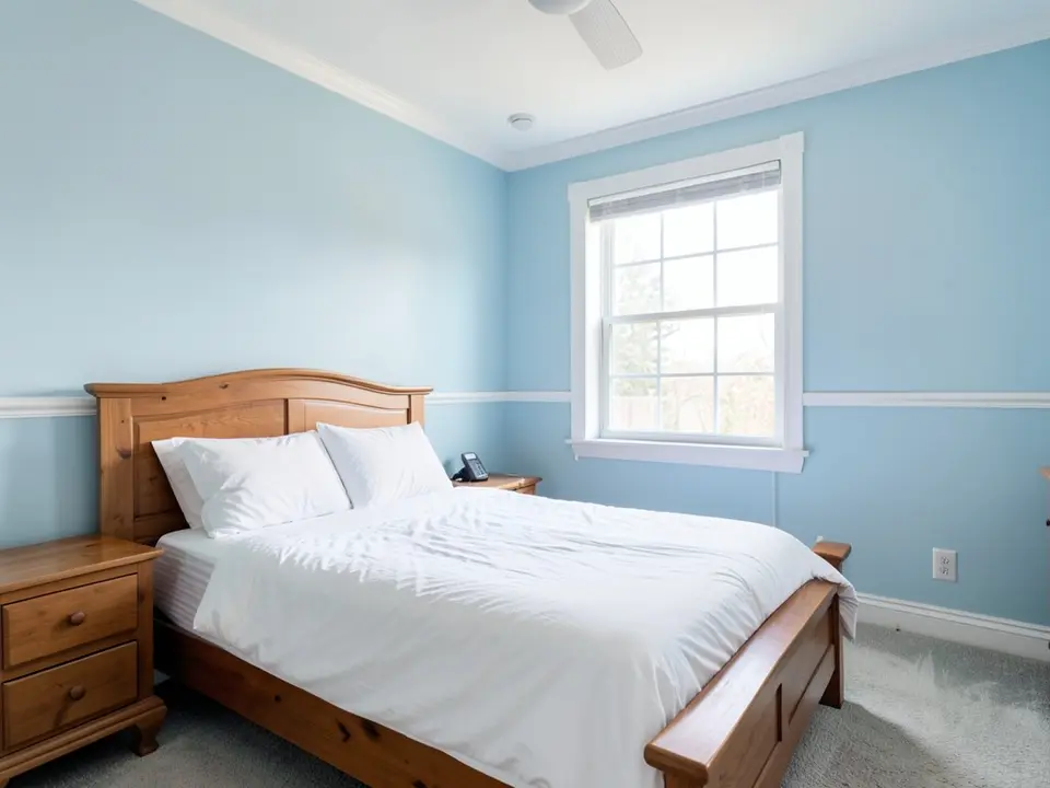 Before
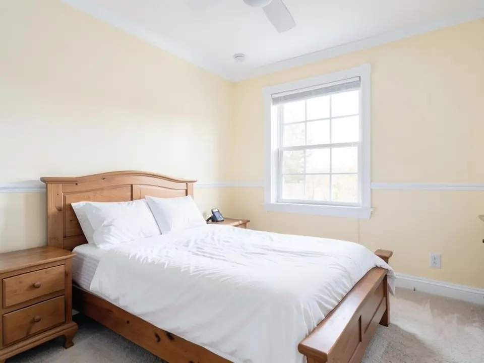 After
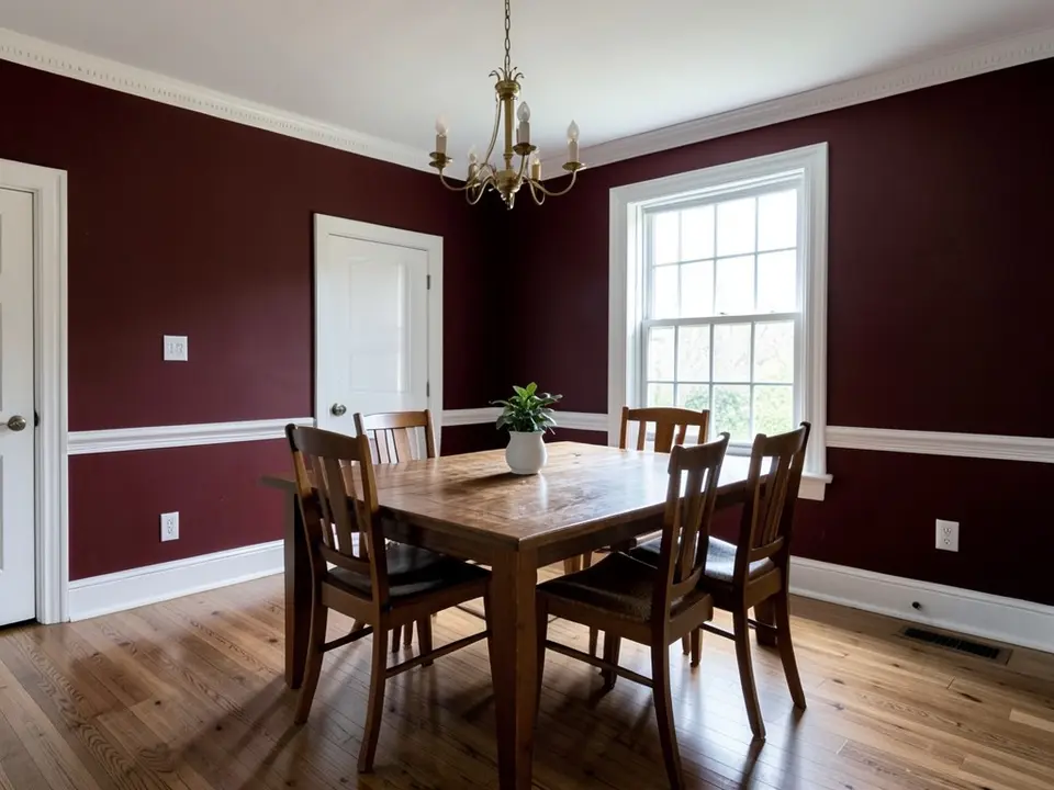 Before
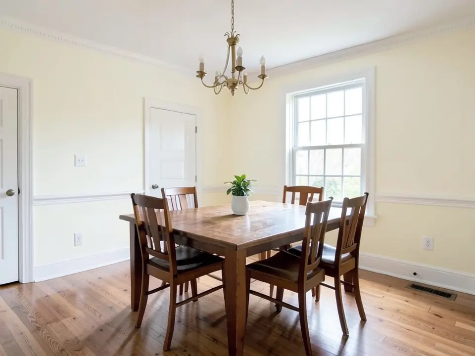 After
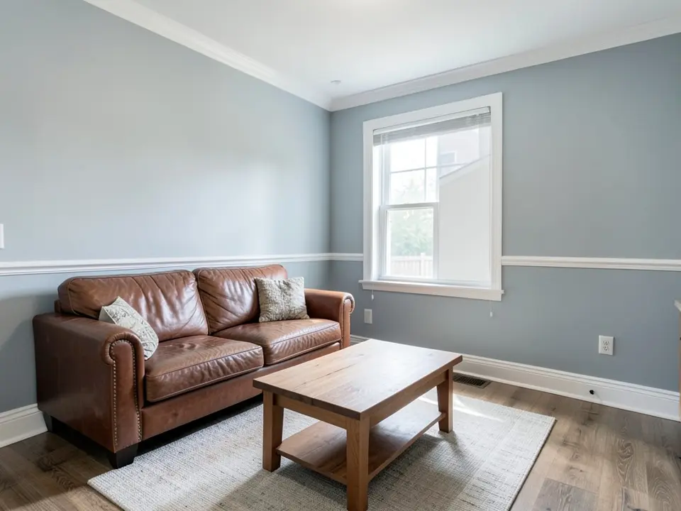 Before
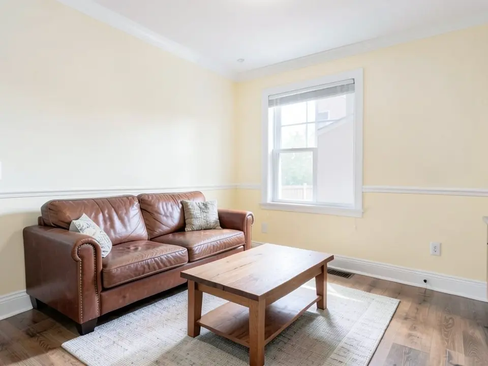 After
How to Preview a Cream on Your Walls
- Photograph the room in daylight. Creams can look yellow in warm light and almost white in cool light, so take the photo in the light you use the room in most and include the white trim.
- Open the paint tool in Custom mode. Upload the photo and describe the change in one sentence: “Paint only the walls a warm cream. Keep the trim, the ceiling, the furniture and the floor exactly the same.” Add “much closer to white than to yellow” if the render comes out too yellow.
- Compare a pale and a deeper cream. Render an ivory and a richer cream next to your white trim. Then paint a large sample and look at it in the morning and the evening.
For cream on cabinets, see cream kitchen cabinets. For greige and taupe, see neutral paint colors, and for a pale yellow, see butter yellow paint colors.
Cream Colors to Try
Benjamin Moore Swiss Coffee OC-45
Benjamin Moore lists Swiss Coffee OC-45 among its most popular cream colors. Designer Kathy Kuo, quoted by Livingetc, says it is bright and cheerful without being too stark, with the slightest green undertone.
Benjamin Moore Gentle Cream OC-96
Kylie M Interiors says Gentle Cream has an LRV of 71.32 and a mix of yellow and orange undertones, leaning more yellow, over an earthy beige base. She calls it a heavy cream that borders on beige, and notes it is the same color as Barely Beige.
Benjamin Moore Soft Chamois OC-13
Benjamin Moore color expert Helen Shaw, quoted by Livingetc, calls Soft Chamois a soothing shade. She says creams like it are perfect for north-facing rooms or spaces without much light.
Sherwin-Williams Greek Villa
Designer Marie Flanigan, quoted by Livingetc, picks Greek Villa as a creamy white. She says its warmth makes a space beautifully luminescent and intimate.
Farrow & Ball Single Cream No.9901
Farrow & Ball calls Single Cream No.9901 a warm light cream with a redder base than most classic creams. It says the color can bring warmth to north-facing rooms and suggests Tallow No.203 for trim.
Sherwin-Williams Alabaster
Kaitlin Madden gives Alabaster an LRV of 82 and calls it one of the brightest creams on her list, so it can read as a soft off-white in some light. She notes its cream tone shows clearly next to true white trim.
Before You Paint a Room Cream
- Benjamin Moore advises leaving cream samples on the wall for at least a few days and paying close attention to undertone and to how natural and artificial light change the color.
- Kaitlin Madden says most creams fall in the 70 to 82 LRV range. If a cream looks too bright in your room, she suggests choosing one with a lower LRV, and she warns that south- or west-facing light can make some creams look like bright white.
- Designer Lisa Sherry, quoted by Livingetc, gravitates toward warm grey and taupe undertones to avoid a cream that tips too yellow.
- Farrow & Ball says Double Cream No.9907 suits north-facing rooms, where it offsets cool light, and calls it ideal for colour drenching. For trim, Kylie M Interiors recommends warm whites such as Benjamin Moore Cloud White or Simply White.
- Test a big sample on more than one wall and check it in the morning, afternoon and evening before you commit.
Cream Paint Colors FAQ
Is it free to try?+
You need a free account to generate. New accounts get 1 free render, and free renders carry a small watermark. After that, paid plans on the pricing page give you more renders without the watermark.
Do I need to sign up?+
Yes. Rendering requires an account so your credits and results can be saved. You can sign in with Google or a one-time code sent to your email.
What is the most popular cream paint color?+
Benjamin Moore names Ancient Ivory OC-133, Acadia White OC-38, Marble White OC-34 and Natural Cream OC-14, all from its Off White Collection. Kaitlin Madden says Swiss Coffee is one of Benjamin Moore's best-sellers.
Is cream paint out of style?+
Kaitlin Madden says cream was common in the early 2000s and has come back as warmer trends replaced bright whites, cool grays and charcoal. Benjamin Moore says creams have long been chosen by homeowners and designers for a balanced, relaxing feel.
What colors go with cream walls?+
Benjamin Moore suggests a soft sage green accent wall, pink and coral accents, or a moody color on trim or doors. Kaitlin Madden adds greens, greige, navy, black and wood tones, and advises avoiding clear, bright colors and neons.
Is cream a good color for a north-facing room?+
Benjamin Moore color expert Helen Shaw, quoted by Livingetc, says creams are perfect for north-facing rooms or spaces without much light. Farrow & Ball recommends its warmer Single Cream and Double Cream for north-facing rooms, and Kylie M Interiors says north light can tone Gentle Cream down slightly while keeping some warmth.
Will the tool change anything besides the paint?+
It should not if you say so, but it is an AI edit, not a mask. Write that the trim, the ceiling, the furniture and the floor stay exactly the same, then compare the render with your photo. In our first tries every cream came out too yellow; describing it as “a soft ivory cream, much closer to white than to yellow” got closer, but our samples still lean slightly yellow.
Will the render match the real paint?+
No. The render shows a color idea, not a paint chip, and your light changes how a cream looks. Creams can look yellow in warm evening light. Paint a large sample next to your trim and look at it at different times of day.
Related Color Visualizers
- Cream kitchen cabinets – cream on cabinets
- Neutral paint colors – greige and taupe
- Butter yellow paint colors – a pale yellow
- Trim paint color visualizer – the trim next to cream
- Paint colors for north-facing rooms – cool light
- Living room paint colors – more living room ideas
See a Cream on Your Own Walls
Upload one photo of your room and compare a few creams before you buy paint.