
Try Neutral Paint Colors on a Photo of Your Own Room
Upload a photo of your room, describe the wall color in a sentence, and see greige, taupe or soft gray against your own sofa, floor and trim before you buy a sample pot.
Free account required. New accounts get 1 free render (watermarked), then paid plans.
Try it on your own photo
Upload a room photo below and describe the neutral you want. Name the furniture, floor, trim and curtains you want to keep.
Neutral Wall Colors Before and After
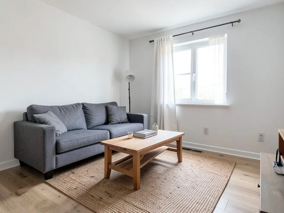
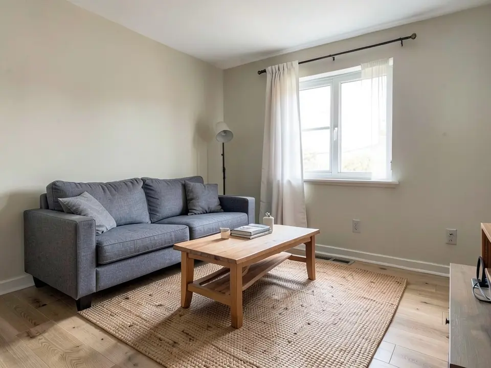
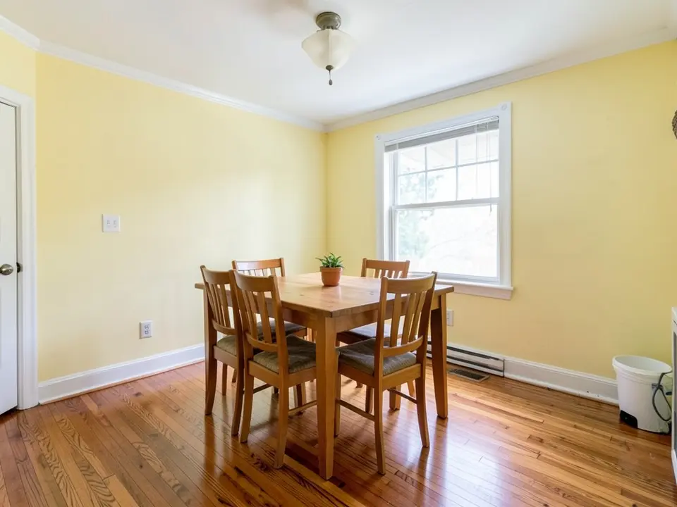
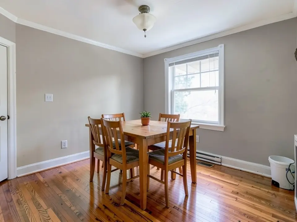
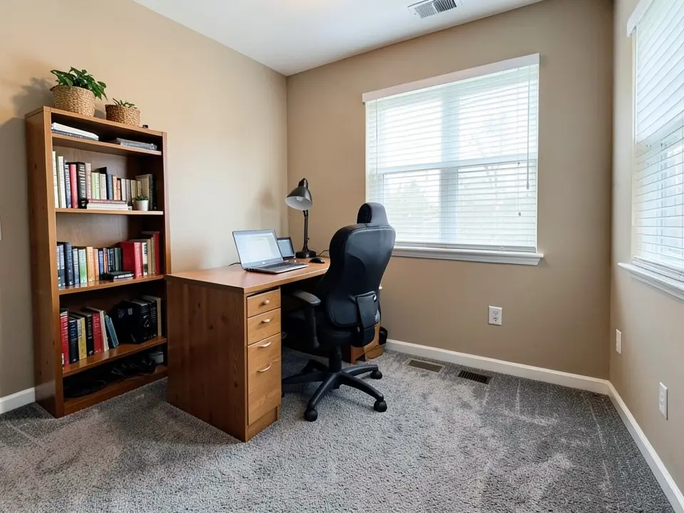
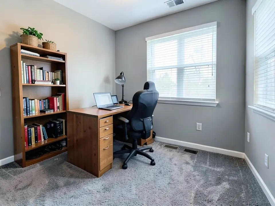
AI-generated sample edits. The before photos are AI-drawn stand-in rooms, not photos of real rooms; the camera angle and light stay the same and the wall color changes. One of the three neutral samples (the living room) was run a second time with a clearer color description after the first run came out olive green; its caption says so, and no sample was picked from more than two runs. The samples were made with our own image model at 4 processing steps, and the live paint tool may use different settings, so your own render may look different. Each caption names anything else that changed. A render shows a color idea, not real paint on a real wall.
 Before
 After
 Before
 After
 Before
 After
How to Preview Neutral Paint Colors on Your Own Photo
- Take a clear photo. Shoot the room at the time of day you use it most, with at least one full wall, the floor and the main furniture in view. A neutral is judged next to the things it sits beside, so keep the sofa, wood tones and flooring in the frame. Keep the lens level and turn the lights on.
- Open the paint tool in Custom mode. Upload the photo and describe the change in one sentence: “Paint only the walls a light warm greige. Keep the sofa, rug, floor, curtains and trim exactly the same.” Name the shade in plain words such as warm greige, light taupe or soft gray. In our own samples, asking for just “a warm greige” came out olive green the first time, so adding “pale beige-gray, not green” helped. Naming what to keep helps, but the AI can still redraw small objects, so check the render.
- Compare two or three neutrals. Render a short list, for example a warm greige, a taupe and a soft gray. A Blissful Nest, a home decor blog, suggests holding a paint sample next to pure white paper to see its undertone and checking samples at different times of day. Download your renders, compare them on the screen you will decide on, then paint a large sample on the real wall.
A neutral also needs a trim color and a ceiling. See the trim paint color visualizer for baseboards and window trim, try the colors by room on the living room paint colors and bedroom paint colors pages, and use the match paint color from a photo tool when you already have a color you like.
Neutral Paint Colors to Try
Greige and warm beige
Greige is a blend of gray and beige, according to A Blissful Nest, and it is easy to place beside wood furniture and light flooring. In our example, plain white walls went a light warm greige.
Taupe
Taupe sits between gray and brown and reads a little more grounded than greige. In our example, pale yellow walls went a mid taupe-gray, grayer than we expected, so name how warm or cool you want it.
Soft gray
A soft gray suits a room with cool light or plenty of white trim. A Blissful Nest groups soft grays with the cool neutrals. In our example, beige walls went a mid-light, slightly cool gray.
Warm and crisp whites
Bob Vila's roundup of neutral paint lists whites alongside grays and beiges. A white is the hardest neutral to judge, because its undertone shows more next to trim. We did not render a white in this set, so compare it on your own photo.
Before You Choose a Neutral
- Look at the undertone first. A Blissful Nest describes warm neutrals as soft beiges, taupes and greige, and cool neutrals as soft grays and crisp off-whites. Bob Vila's neutral roundup also keeps coming back to undertones as what gives each shade its character.
- Use a white reference. A Blissful Nest suggests holding the sample against pure white paper so the undertone shows.
- Think about window direction. A Blissful Nest says north-facing rooms get cooler light, so warmer neutrals can help, and south-facing rooms get warm, bright sun, so cooler neutrals can balance it.
- Match the floor and furniture. The same blog says to consider the wood tones and flooring undertones, because they change how the wall color reads.
- Keep a neutral room from going flat. A Blissful Nest suggests layering textures such as linen, wood, jute and plants.
- Check the details in the render. An AI edit can move or change small objects. Compare the render with your real room before you decide.
Neutral Paint Colors FAQ
Is the neutral paint color visualizer free?+
You need a free account to generate. New accounts get 1 free render, and free renders carry a small watermark. After that, paid plans on the pricing page give you more renders without the watermark.
Do I need to sign up?+
Yes. Rendering requires an account so your credits and results can be saved. You can sign in with Google or a one-time code sent to your email.
What counts as a neutral paint color?+
Sources use the word loosely. Bob Vila's neutral roundup includes grays, whites, beiges, greiges and some shades with a faint hint of blue, pink or green. A Blissful Nest groups beige, taupe and greige as warm neutrals and soft gray and off-white as cool ones. Try a few on a photo of your own room and see which one you can live with.
Can it change only the walls and keep my furniture?+
That is the goal, and the best results come when you name the furniture, floor, trim and curtains to keep. It is an AI edit, not a mask, so the render can still shift or redraw small items. Compare it with your real room before you decide.
Should I pick a warm or a cool neutral?+
There is no single answer. A Blissful Nest, a home decor blog, suggests warmer neutrals for rooms with cool north light and cooler neutrals for rooms with strong south sun, and also says to match the undertone of your floor and furniture. Render one of each on your photo and paint a large sample.
Will the render match the real paint?+
No. The render shows a color idea, not a paint chip, and the color can come out different from the name you typed. In our own samples one request for greige came out olive green. Paint a large sample on one wall and look at it in the morning and at night before you buy gallons.
Can I use the same neutral in every room?+
You can, and many people do for a calm, connected look. See the open concept paint colors page for how one color runs across a living, dining and kitchen area.
Does it work on a dark or small photo?+
Yes, as long as the photo shows the walls you want to change. A bright, level photo with a full wall in view gives the clearest result. A dark photo may hide the wall color, so turn the lights on.
Related Color Visualizers
- Interior paint visualizer – walls and whole rooms
- Living room paint colors – the room where a neutral works hardest
- Bedroom paint colors – sage, greige and soft blue
- Trim paint color visualizer – baseboards, crown molding and window trim
- Match paint color from a photo – find a color you already like
- Open concept paint colors – one color across living, dining and kitchen
- Terracotta paint colors – clay and baked-earth walls
See Your Room in a Neutral Color
Upload one photo and compare a few neutral wall colors before you paint.