
Try Wainscoting Paint Colors, Panels and Wall Above, on Your Own Photo
Upload a photo of your paneled dining room, hall or entry, describe the color for the panels and the wall above, and compare a two-tone pairing with a one-color look before you pick up a brush.
Free account required. New accounts get 1 free render (watermarked), then paid plans.
Try it on your own photo
Upload a photo of the room below and describe the paint. Say which part to change (the panels, the wall above, or both) and name what to keep.
Wainscoting Paint Colors Before and After
AI-generated sample edits. The before photos are AI-drawn stand-in rooms, not photos of real rooms; the camera angle and light stay the same and the paint color changes. Each of the three samples is a single run. The samples were made with a different image model than the one the live paint tool uses by default (and with 4 processing steps), so your own render may look different. Each caption names anything else that changed. A render shows a color idea, not real paint on a real wall.
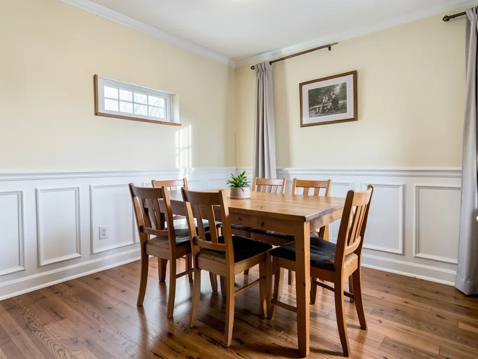 Before
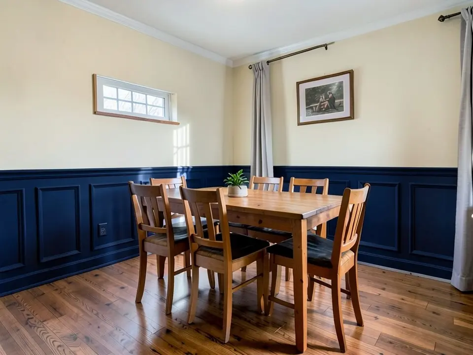 After
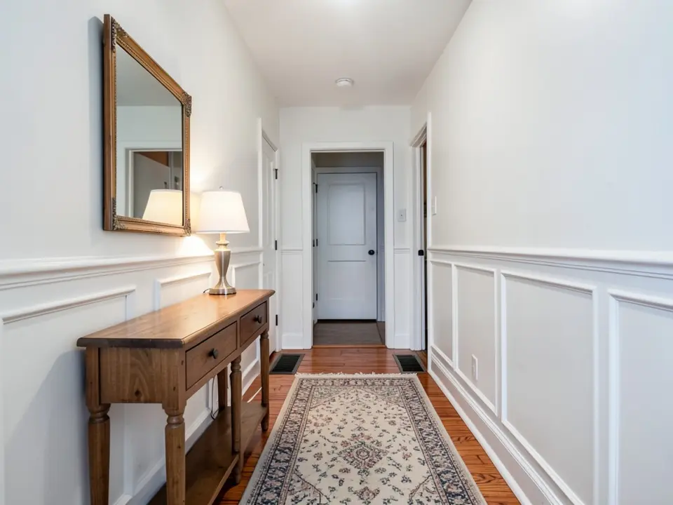 Before
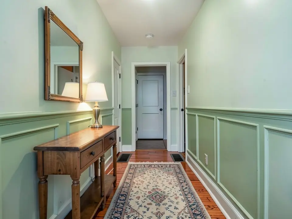 After
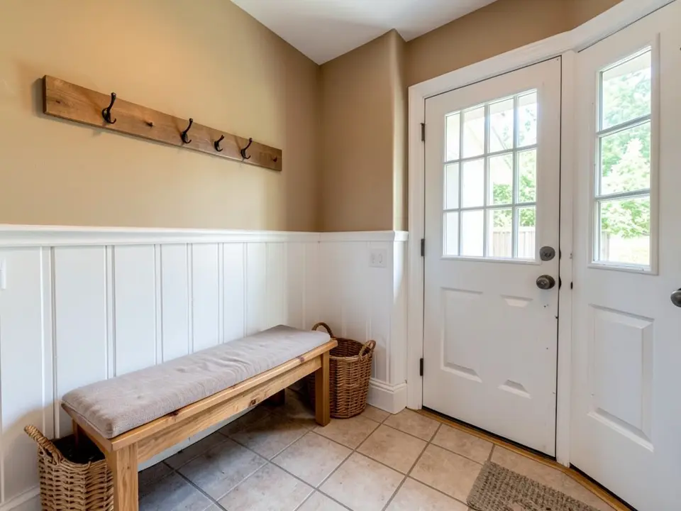 Before
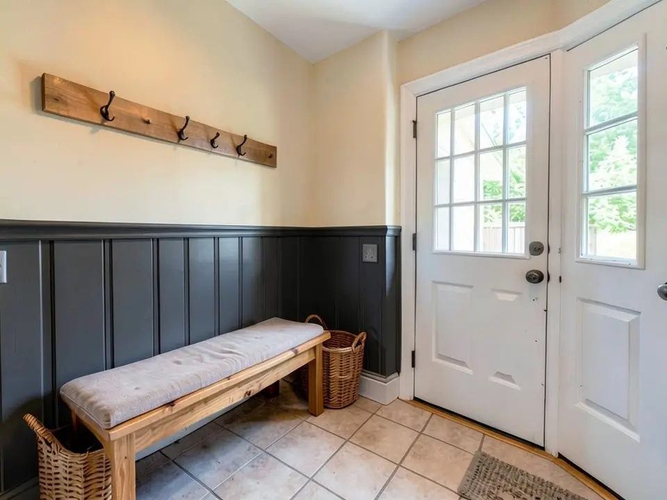 After
How to Preview Wainscoting Paint Colors on Your Own Photo
- Take a clear photo. Stand back far enough to see the top of the panels, the chair rail, the wall above, the baseboard and the floor. Turn the lights on and keep the lens level so the panel lines stay straight.
- Open the paint tool in Custom mode. Upload the photo and describe the change in one sentence. For a two-tone look: “Paint only the wainscoting panels and chair rail deep navy. Keep the upper wall, furniture, art and floor exactly the same.” For one color: “Paint the wainscoting and the wall above it the same soft sage green.” Say what to do with the baseboard, because the AI may follow the panels.
- Render both ideas, then test a sample. Compare a two-tone version with a one-color version of the same room. A render does not show paint sheen, so paint a sample board and look at it in the room, in the daylight and the evening, before you buy.
Paneling has trim, too. See the trim paint color visualizer for the baseboard and chair rail, the dining room paint colors page for a paneled dining room and the hallway paint colors page for halls and entries. For two colors split by a paint line on a plain wall, with no panels, see two-tone wall paint ideas.
Wainscoting Paint Color Pairings to Try
Two-tone: darker panels, lighter wall
Benjamin Moore's wainscoting ideas page calls a wainscoting in a different color from the wall above the classic approach and says the contrast makes the paneling stand out. It also says darker paneling adds drama and a modern edge. In our example, white panels went deep navy under a cream wall.
Tall dark board-and-batten
The same page describes dark board-and-batten carried up to about two-thirds of the wall, with a lighter wall above, as a way to add contrast without overwhelming a room. In our example, white boards went charcoal gray under a pale warm off-white.
Monochrome: one color on panels and wall
Benjamin Moore says lighter and darker shades of one color on the paneling and the wall keep a room cohesive, and that one dark color in several sheens can add depth. Our example used one flat sage on both, and the panel shapes still read. We did not render different sheens.
White panels with a richer wall
The same page says white or off-white wainscoting is the most common choice and suits nearly any room, and that the traditional pairing sets white or off-white lower paneling under a richer upper wall. We did not render this one, so try it on your own photo.
Before You Paint Wainscoting
- Decide if the paneling should stand out or blend in. Benjamin Moore says contrast makes it stand out, while shades of one color keep the room cohesive. Render one of each.
- Updating beats replacing. Livingetc says repainting original panelling in a contemporary shade can change the feel of a whole room, and that a moody neutral is a safe way to ease classic panelling into the present.
- Think about sheen. Livingetc says gloss is more durable than flatter finishes and reflects light, and Benjamin Moore says higher-gloss finishes on neutral wainscoting highlight architectural details. A render cannot show sheen, so test a sample.
- Pair it with what is above. Livingetc describes a solid-colored wainscot anchoring a busy wallpaper print. If you have patterned wallpaper above the rail, render a solid panel color against it.
- Choose by room. Benjamin Moore suggests dark-and-white contrast or tonal schemes for dining and living rooms, deeper greens or grays for high-traffic halls and entries, and warm neutrals or soft colors in bathrooms.
- Decide on the baseboard and chair rail. This is our advice: say in your request whether they follow the panels or stay white, because in our navy sample the baseboard followed the panels.
- Check the details in the render. An AI edit can shift small things such as a switch plate, a picture or a lamp. Compare the render with the real room before you decide.
Color and planning advice above is from the Livingetc and Benjamin Moore pages on wainscoting ideas. We do not sell paint, we name no paint colors, and a render is not a color match.
Wainscoting Paint Colors FAQ
Is the wainscoting paint color visualizer free?+
You need a free account to generate. New accounts get 1 free render, and free renders carry a small watermark. After that, paid plans on the pricing page give you more renders without the watermark.
Do I need to sign up?+
Yes. Rendering requires an account so your credits and results can be saved. You can sign in with Google or a one-time code sent to your email.
Can it paint only the panels and keep the wall above?+
That is the goal, and the best results come when you say which part to paint and name what to keep. It is an AI edit, not a mask, so it can follow the wrong part. In our three samples the upper wall and furniture stayed put, but the baseboard followed the panels in the navy sample. Compare the render with the real room.
What is the difference between two-tone and monochrome wainscoting?+
Two-tone paints the wainscoting a different color from the wall above, which Benjamin Moore calls the classic approach and says makes the paneling stand out. Monochrome uses one color, or lighter and darker shades of it, on both, which Benjamin Moore says keeps the room cohesive.
Should wainscoting be white?+
Not necessarily. Benjamin Moore says white or off-white is the most common choice and suits nearly any room, but it also shows dark and colored paneling. Render white and one darker option side by side on your own photo.
What sheen should I use on wainscoting?+
Livingetc says gloss is more durable than flatter finishes and reflects light. Benjamin Moore says higher-gloss finishes on neutral wainscoting highlight architectural details. The render does not show sheen, so look at a painted sample before you decide.
Can I preview a painted-on wainscoting look without panels?+
Benjamin Moore mentions painting the lower and upper wall in different colors for a faux wainscoting effect without millwork. We did not test that kind of request with the tool, so try it on your own photo and check that the dividing line comes out where you want it.
Will the render show how the color looks in my room?+
No. The render shows a color idea, not the color under your own lights or the daylight through your windows. Paint a large sample and look at it in the morning and in the evening before you buy gallons.
Related Color Visualizers
- Trim paint color visualizer – baseboards, chair rail and crown molding
- Dining room paint colors – walls for a paneled dining room
- Hallway paint colors – halls, stairs and entries
- Accent wall visualizer – one feature wall
- Interior paint visualizer – walls and whole rooms
- Match paint color from a photo – find a color you already like
- Shiplap accent wall – colors for a plank feature wall
See Your Paneling in a New Color
Upload one photo and compare a two-tone and a one-color look before you paint.