
Orange Paint Colors, Tried on a Photo of Your Room
Burnt orange, tangerine, rust or citrus: upload a photo of your living room, bedroom or kitchen, name the orange, and see it on your walls before you buy paint.
Free account required. New accounts get 1 free render (watermarked), then paid plans.
Try it on your own photo
Upload a photo of your room with the lights on. Name the orange and say that only the walls change and the trim, ceiling, furniture and floor stay exactly the same.
Orange Walls, Before and After
AI-generated sample edits of three rooms. The before photos are AI-drawn stand-ins, not photos of real homes; the camera angle and light stay the same and only the paint should change. All three were rerun: in the first tries the model painted the trim and ceiling in the living room, left a gray patch in the office and painted the wainscot panels in the dining room, so we reworded the prompt and kept the closer try. The captions name what the model changed besides the paint and where the color came out different from what we asked for. The samples were made with an image model and settings (4 processing steps) that may differ from the live paint tool, so your own render may look different. A render shows a color idea, not real paint.
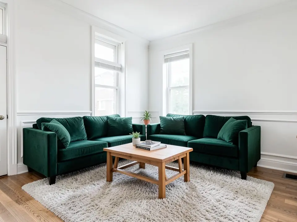 Before
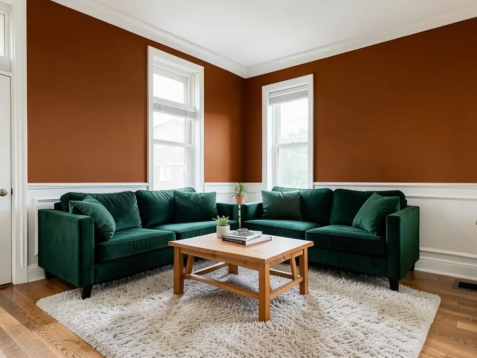 After
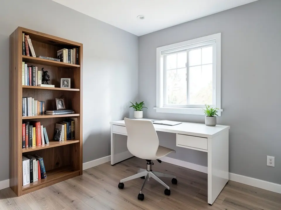 Before
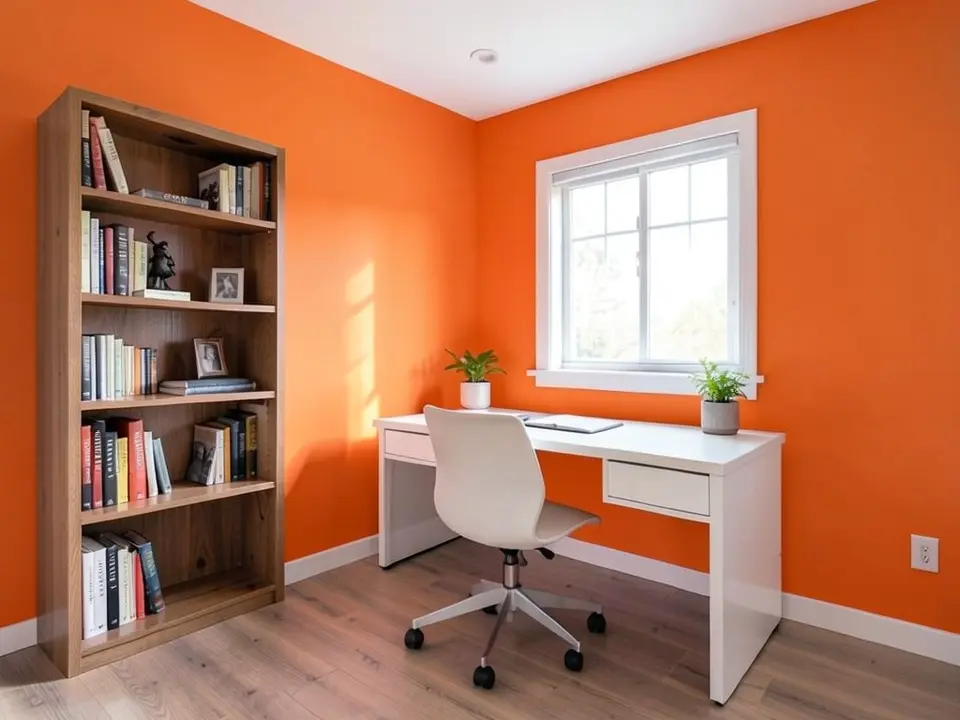 After
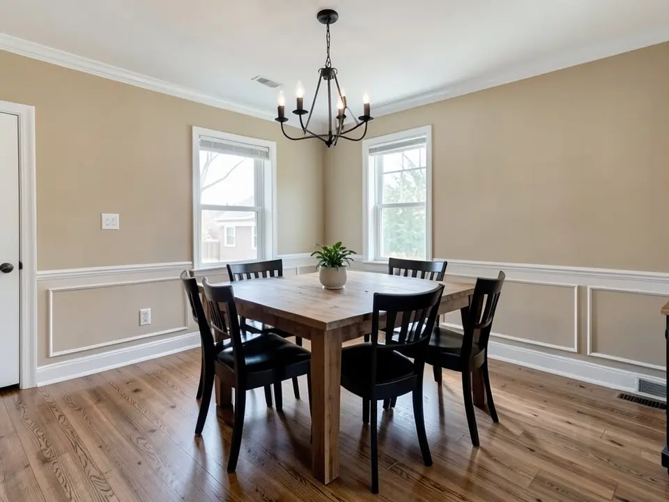 Before
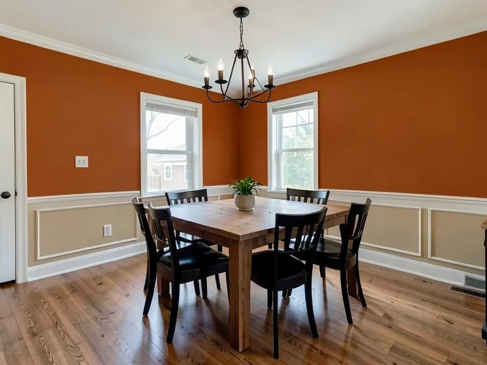 After
How to Preview an Orange on Your Walls
- Photograph the room in daylight. Orange gets stronger in warm light, so take the photo in the light you use the room in most and include the trim.
- Open the paint tool in Custom mode. Upload the photo and describe the change in one sentence: “Paint only the walls a warm burnt orange. Keep the trim, the ceiling, the furniture and the floor exactly the same.” For a room with a chair rail, say “paint only the wall above the chair rail” and that every piece of trim stays white.
- Compare a burnt and a bright orange. Render a muted burnt orange and a brighter tangerine, or try one accent wall, then paint a large sample and look at it in the morning and the evening.
For terracotta and clay, see earthy paint colors. For orange on one wall, use the accent wall visualizer, and for other deep colors, see moody paint colors.
Orange Paint Colors to Try
Farrow & Ball Charlotte's Locks No.268
Farrow & Ball calls Charlotte's Locks No.268 a deep and dramatic orange that is most striking in small areas set against All White or Black Blue. Designers Todd Nickey and Amy Kehoe, quoted by Remodelista, say it is vibrant with a rootedness that feels earthy and tasteful.
Farrow & Ball Dutch Orange No.W76
Farrow & Ball describes Dutch Orange No.W76 as a clean bright orange that brings an enveloping warmth to rooms. The brand suggests it with Verdigris Green and Skimmed Milk White, or with a Duck Green trim.
Benjamin Moore Fireball Orange 2170-10
Benjamin Moore lists Fireball Orange 2170-10 among its most popular orange paint colors and calls it charged. The same page names Topaz 070 as its radiant pick and Terra Mauve 105 as its deep one.
Paint & Paper Library Rufus (455)
Designer Jessica Williamson of Bradley Van Der Straeten, quoted by Remodelista, picks the archived Paint & Paper Library Rufus (455) for its rusty deepness. She says it is so rich it seems to glow even in grey weather.
Tikkurila Tvt L400 (burnt orange)
Tikkurila recommends Tvt L400 for people who prefer a more intense burnt orange in a living room. It suggests pairing this toasty orange with a rich teal and an off-white for finishing touches.
Tikkurila Heat S311 (tangerine)
Tikkurila calls Heat S311 a fiery tangerine for a room that needs an energy boost. It advises offsetting that intensity with a warm white such as Arctic Fox S503.
Before You Paint a Room Orange
- Tikkurila suggests a lighter orange or a single accent wall in smaller or darker rooms, and deeper burnt or copper-infused oranges for larger, well-lit living rooms.
- Benjamin Moore advises identifying the undertones already in your home first, then choosing an orange that complements them, and sampling extensively in your own lighting.
- Designer Kyle Schuneman, quoted by the Portland Press Herald, says to try three or four shades in daylight and artificial light, and warns that orange, like red, can need three or four coats for an even finish.
- Dulux suggests painting the ceiling and trim crisp white around a burnt orange wall for a fresh, airy feel, or keeping walls pale and neutral so one orange wall or nook stands out.
- Test a big sample on two walls and look at it morning, noon and night before you buy paint.
Orange Paint Colors FAQ
Is it free to try?+
You need a free account to generate. New accounts get 1 free render, and free renders carry a small watermark. After that, paid plans on the pricing page give you more renders without the watermark.
Do I need to sign up?+
Yes. Rendering requires an account so your credits and results can be saved. You can sign in with Google or a one-time code sent to your email.
What colors go with burnt orange walls?+
Tikkurila lists brown, tan, grey, beige, sage and olive green, and pale or deep blues as good partners for burnt orange. Dulux names teal, navy blue, grey and warm neutrals.
Is orange a good color for a living room?+
Tikkurila says orange adds warmth to a living room and helps compensate for small windows or a north-facing aspect. Dulux says burnt orange's earthy undertones suit rustic living rooms with wood and metal.
Should I paint a whole room orange or just an accent wall?+
Tikkurila notes that many people use burnt orange as an accent colour because it can feel hard to pair. Dulux suggests a single wall or nook in burnt orange with the rest of the room in pale neutrals, while Tikkurila says gentler oranges like Doll H405 can work as an all-wall colour.
What is the difference between burnt orange and bright orange?+
Designer Betsy Burnham, quoted by the Portland Press Herald, says a burnt orange chip can look more like a brown but reads as orange once it is on a surface. Tikkurila says burnt orange suits a more mature, sophisticated scheme, while fiery tangerine oranges bring a strong energy boost.
Will the tool change anything besides the paint?+
It should not if you say so, but it is an AI edit, not a mask. Write that the trim, the ceiling, the furniture and the floor stay exactly the same, then compare the render with your photo. Orange was the hardest color in this set: in our first tries it spread onto the trim and ceiling, left a gray patch and painted the wainscot panels. Naming every piece of trim and saying “only the wall above the chair rail” fixed it.
Will the render match the real paint?+
No. The render shows a color idea, not a paint chip, and your light changes how an orange looks. Strong oranges can look much brighter on a whole wall than on a chip. Paint a large sample and look at it at different times of day.
Related Color Visualizers
- Earthy paint colors – terracotta and clay
- Accent wall visualizer – orange on one wall
- Moody paint colors – other deep colors
- Home office paint colors – more office ideas
- Dining room paint colors – more dining ideas
- Butter yellow paint colors – a softer warm color
- Burgundy paint colors – deep wine-red walls
- Coral paint colors – warm pink-orange walls
See an Orange on Your Own Walls
Upload one photo of your room and compare a few oranges before you buy paint.