
Red Paint Colors, Tried on a Photo of Your Room
Tomato, crimson, brick or burgundy: upload a photo of your dining room, living room or library, name the red, and see it on your walls before you buy paint.
Free account required. New accounts get 1 free render (watermarked), then paid plans.
Try it on your own photo
Upload a photo of your room with the lights on. Name the red and say that only the walls change and the trim, ceiling, furniture and floor stay exactly the same.
Red Walls, Before and After
AI-generated sample edits of three rooms. The before photos are AI-drawn stand-ins, not photos of real homes; the camera angle and light stay the same and only the paint should change. One of the three was rerun: the first dining room try painted the white wainscoting red, so we asked for the wall above the chair rail only and kept that try. The captions name what the model changed besides the paint and where the color came out different from what we asked for. The samples were made with an image model and settings (4 processing steps) that may differ from the live paint tool, so your own render may look different. A render shows a color idea, not real paint.
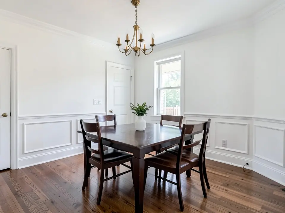 Before
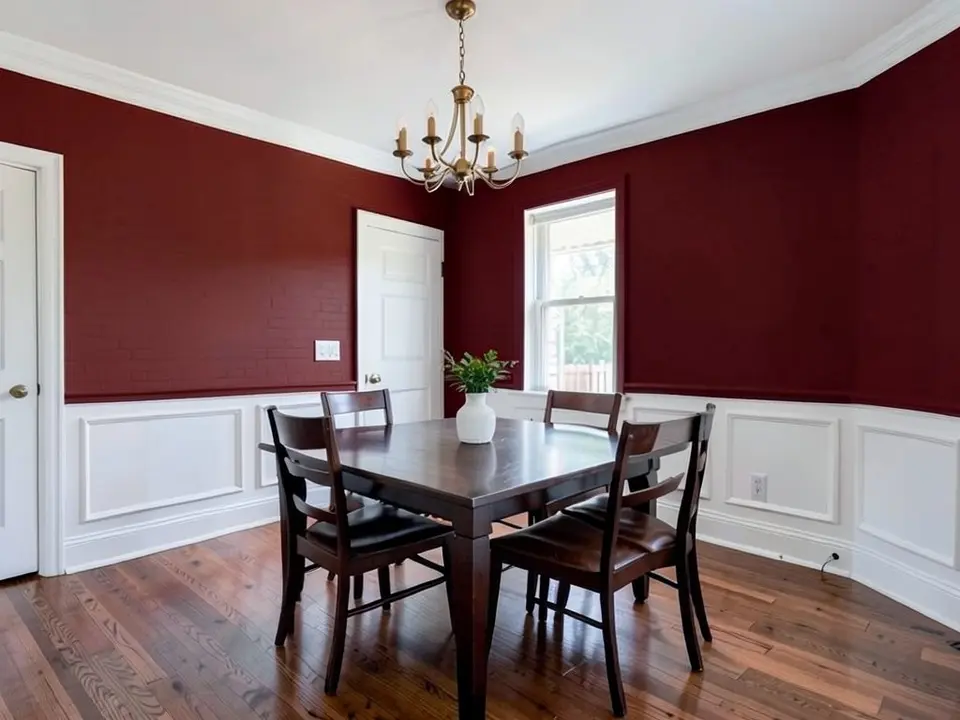 After
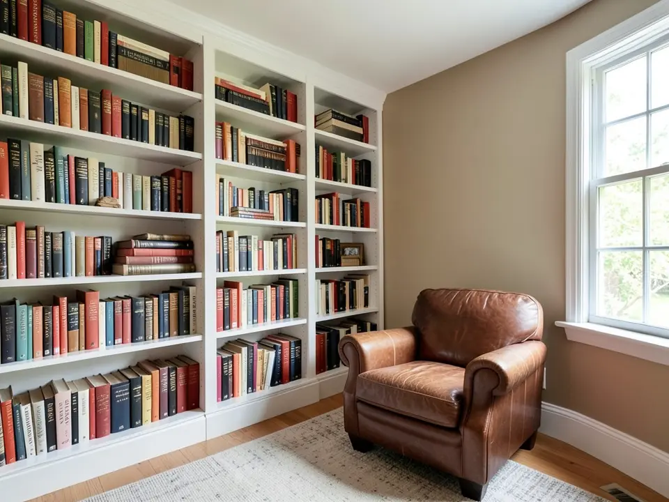 Before
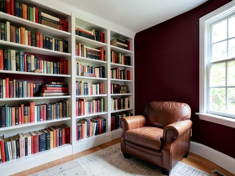 After
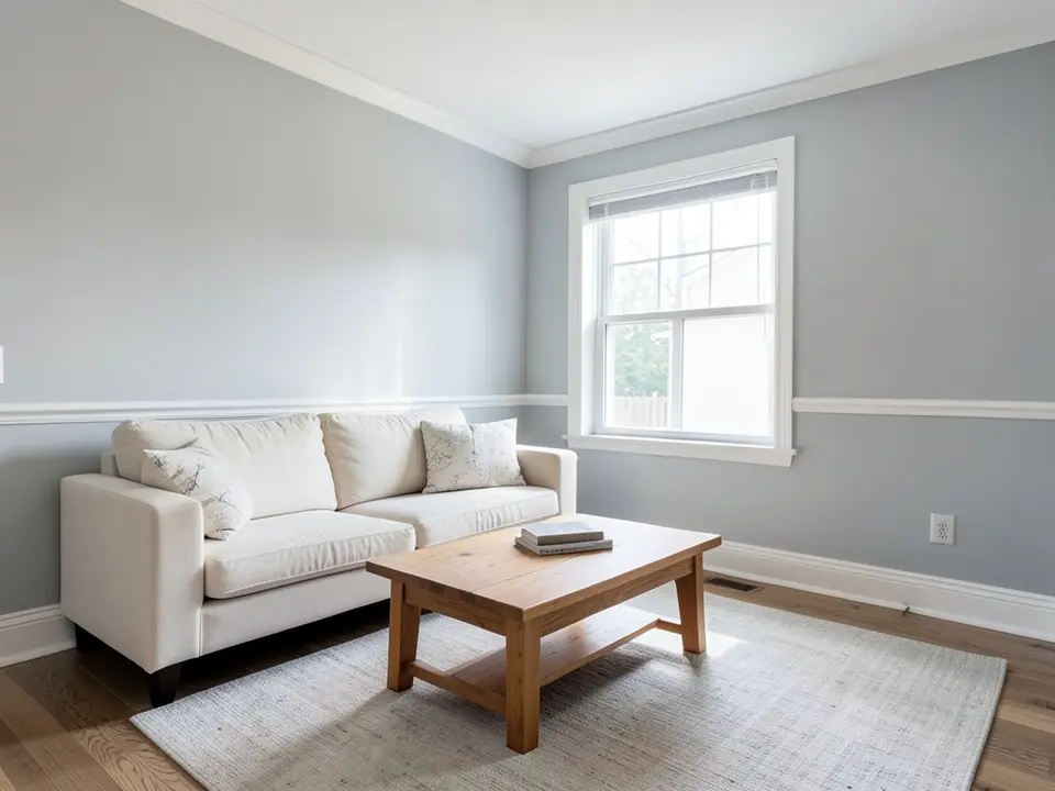 Before
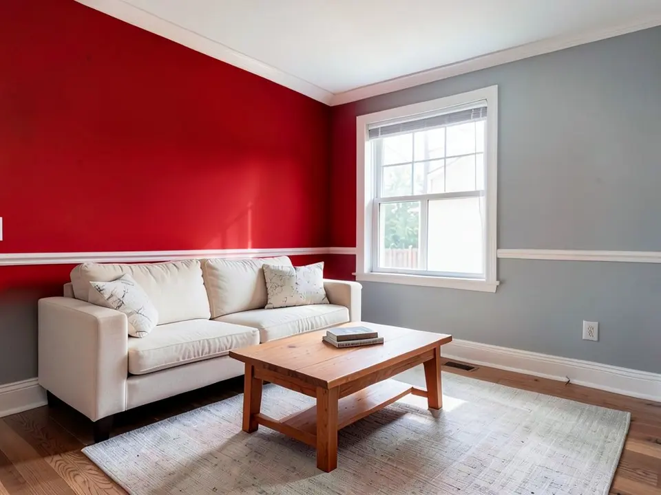 After
How to Preview a Red on Your Walls
- Photograph the room in daylight. Reds get deeper in dim light and brighter in sun, so take the photo in the light you use the room in most and include the trim.
- Open the paint tool in Custom mode. Upload the photo and describe the change in one sentence: “Paint only the walls a deep classic red. Keep the trim, the ceiling, the furniture and the floor exactly the same.” For a room with wainscoting, say “paint only the wall above the chair rail” and that the wainscoting stays white.
- Compare one wall with the whole room. Render a red accent wall and the whole room in red, and a brighter and a deeper red, then paint a large sample and look at it in the morning and the evening.
For more dining room ideas, see dining room paint colors. For red on one wall, use the accent wall visualizer, and for other deep colors, see moody paint colors.
Red Paint Colors to Try
Farrow & Ball Rectory Red No.217
Farrow & Ball says Rectory Red No.217 is a warming colour that intensifies in a small space to create a welcoming room. Remodelista shows Dennis Austin of Daab Design using it on the walls, trim and ceiling of a Georgian music room in London.
Farrow & Ball Book Room Red 50
Remodelista reports that Book Room Red 50 is the favourite red of Anaïs Bléhaut, director of Daab Design. She used it on the walls, steps and railing of a whole stairwell in a London Victorian house.
Farrow & Ball Picture Gallery Red 42
Lea Korzeczek of Studio Oink, quoted by Remodelista, says Picture Gallery Red 42 is particularly suited to hanging classical art and old oil paintings in front of it. She adds that the colour sets accents and creates an intimate atmosphere.
Benjamin Moore Caliente
Helen Shaw of Benjamin Moore, quoted by Homes & Gardens, describes Caliente as a classic red and suggests pairing it with beige for a rustic feel or with purples and turquoise for a maximalist look. Homes & Gardens suggests it for a dining room or a cozy living room.
Farrow & Ball Incarnadine
Patrick O'Donnell of Farrow & Ball, quoted by Homes & Gardens, calls Incarnadine a ripe tomato of a red that would look smart in a dining room with mid-century furniture. Homes & Gardens suggests teaming it with warm whites for balance.
Benjamin Moore Cottage Red
Domino reports that Brian Smith of Studio Tack used Benjamin Moore Cottage Red in the library at Sound View in Greenport, New York. Smith says he chose it for a sense of sophistication.
Before You Paint a Room Red
- Brian Smith of Studio Tack, quoted by Domino, uses a matte finish for red walls and ceilings because matte absorbs more pigment and makes the red look denser; Clare also recommends matte or eggshell to soften red and reduce glare.
- Boxwood Avenue says south-facing rooms keep reds warm and true to the chip, while north-facing rooms cool and mute them, and that evening light deepens red.
- Boxwood Avenue advises using primer and expecting extra coats, and notes that red often looks patchy until the last coat goes on.
- Homes & Gardens says darker or more muted reds keep the colour from feeling overbearing. Designer Luis Carmona, quoted there, says burgundy or wine reds add sophistication, and mauve or terracotta reds feel calmer.
- Test a big sample, at least 2 feet square as Boxwood Avenue suggests, on two walls and look at it morning, noon and night before you buy paint.
Red Paint Colors FAQ
Is it free to try?+
You need a free account to generate. New accounts get 1 free render, and free renders carry a small watermark. After that, paid plans on the pricing page give you more renders without the watermark.
Do I need to sign up?+
Yes. Rendering requires an account so your credits and results can be saved. You can sign in with Google or a one-time code sent to your email.
Is red a good color for interior walls?+
Clare says red can work beautifully on interior walls and that softer reds suit dining rooms, living spaces and bedrooms. Luis Carmona, quoted by Homes & Gardens, says red is best where energy is wanted, such as dining areas, playrooms or creative workspaces.
Should I paint a red accent wall or the whole room?+
Helen Shaw of Benjamin Moore, quoted by Homes & Gardens, says a statement wall is a good way to try red before committing to a full room. Brian Smith, quoted by Domino, disagrees and says red works best when it is allowed to saturate a room, and Boxwood Avenue also advises painting the whole room.
What colors go with red walls?+
Clare says red pairs best with softer neutrals, warm whites and grounded tones, and that strong neons or primary colours can clash. Boxwood Avenue adds warm browns, black, cream, muted greens, purple and orange, with dark wood furniture.
What finish is best for red paint?+
Clare says matte and eggshell are often the best finishes for red walls because they soften the colour and hide imperfections. Brian Smith, quoted by Domino, uses matte on walls and high gloss on trim and moldings in the same red.
Will the tool change anything besides the paint?+
It should not if you say so, but it is an AI edit, not a mask. Write that the trim, the ceiling, the furniture and the floor stay exactly the same, then compare the render with your photo. In our first dining room try the red spread onto the white wainscoting; saying “only the wall above the chair rail, keep all the wainscoting white” fixed it.
Will the render match the real paint?+
No. The render shows a color idea, not a paint chip, and your light changes how a red looks. Deep reds can read almost brown at night. Paint a large sample and look at it at different times of day.
Related Color Visualizers
- Dining room paint colors – a common room for red
- Accent wall visualizer – red on one wall
- Moody paint colors – other deep colors
- Earthy paint colors – terracotta and clay
- Pink paint colors – a softer red
- Front door color visualizer – a red front door
- Orange paint colors – burnt, rust and soft orange walls
- Burgundy paint colors – deep wine-red walls
See a Red on Your Own Walls
Upload one photo of your room and compare a few reds before you buy paint.