
Compare Paint Colors: How to Tell Two Shades Apart Before You Buy
Compare lightness, undertone and light, then render two colors on one room photo and view them side by side. A screen is a shortlist tool: confirm with real samples.
Free account required. New accounts get 1 free render (watermarked), then paid plans.
How to Compare Paint Colors Properly
Two chips that look alike in the store can look different on your wall. Compare in this order: lightness, undertone, then light and context, following the guides listed at the end.
- Compare LRV first. LRV is the light reflectance value, a 0 to 100 scale where a higher number reflects more light. Brands print it on their color pages. One guide says a gap of about 5 points is where people start to see a difference, 10 or more is dramatic, and within 3 points undertone decides. That is a rule of thumb, not a standard.
- Check the undertone. An undertone is the faint secondary hue beneath the main color, warm (yellow, red, orange) or cool (blue, green, purple). Whites have them too, and a mismatch is a common reason a color looks wrong beside your floor or counters.
- Mind the light direction. The same guide says north-facing rooms make cool colors look gray, while south-facing rooms amplify warm undertones. Check the brightest and the darkest wall.
- Use big samples. Paint at least 12 by 12 inches on the wall or a board, with a white border between patches. Small chips hide differences.
- Look at different times of day. Morning, midday, evening and under your lamps.
- Compare against fixed items. Hold samples near the floor, counters and trim that are staying.
- Keep the group small. Two or three at a time. With more, compare a pair, keep the winner, bring in the next.
Three Real Comparisons
All LRV figures below are from the Benjamin Moore color pages (a paint brand, so it has a stake in how its colors are described). We use one brand so the numbers share a source.
Two whites: Chantilly Lace vs White Dove
Benjamin Moore Chantilly Lace OC-65 has an LRV of 90.04 and White Dove OC-17 has an LRV of 83.16, a gap of about 7 points. Side by side, White Dove is the softer, creamier one. Whites move the most between morning and evening light, so test this pair on a board.
Two neutrals: Revere Pewter vs Edgecomb Gray
Benjamin Moore Revere Pewter HC-172 has an LRV of 55.05 and Edgecomb Gray HC-173 has an LRV of 63.09, a gap of about 8 points, so Edgecomb Gray will look noticeably lighter on the same wall. Benjamin Moore calls Revere Pewter a bridge between warm and cool tones and Edgecomb Gray a warm, welcoming neutral.
Two darks: Hale Navy vs Black
Benjamin Moore Hale Navy HC-154 has an LRV of 8.36 and Black HC-190 has an LRV of 4.56, a gap under 4 points. At numbers this low the lightness is close, so hue does the work: one reads as blue, the other as near-black.
What a Screen Can and Cannot Compare
A screen can
- Show light, mid and dark options on the same room to cut the list.
- Show a color beside your sofa and floor.
- Give you pictures to show a partner or painter.
A screen cannot
- Match a paint chip: every display shifts color.
- Show how daylight and bulbs change it through the day.
- Replace a painted sample on your own wall.
Compare Two Colors on Your Own Room
- Photograph the room once. In daylight.
- Render color one. Open the paint tool, upload it, name the first color and list what must stay.
- Render color two on the same photo. Change only the color word in your sentence.
- Look at the two results side by side. Check the whole picture, not just the wall.
- Buy two sample pots. Then do the wall test above.
The interior mode is the same tool, and our AI room painter page has more tips.
One Room, Two Wall Colors
AI-generated edits of one stand-in living room, not a real home, both from the same before image. Each was run once with the prompt printed below, with no rewording and no best-of-several pick. We used 4 processing steps, possibly more than the live tool, so your render can look rougher.
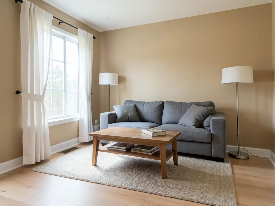 Before
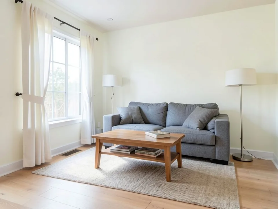 AfterBefore
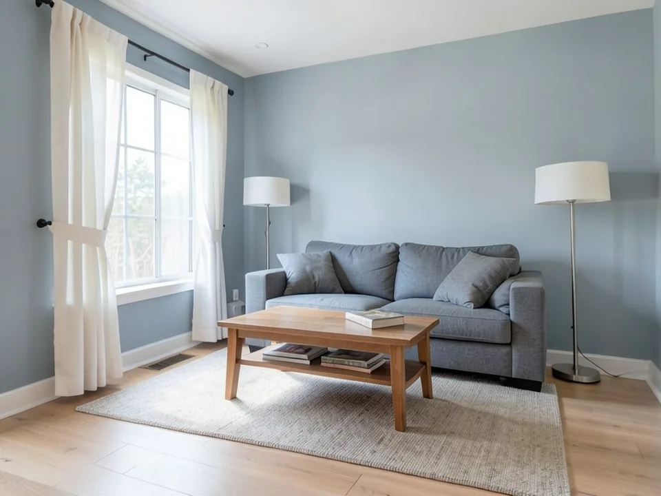 After
The exact prompts
Repaint only the walls a soft warm white. Keep the white baseboards, the sofa, the cushions, the coffee table, the rug, the lamp, the window, the curtains, the floor and the camera angle exactly the same
Repaint only the walls a light cool gray. Keep the white baseboards, the sofa, the cushions, the coffee table, the rug, the lamp, the window, the curtains, the floor and the camera angle exactly the same
Neither color matches our words: the warm white came out cream and the gray came out blue. That is why a render is a shortlist tool. The comparison still shows which sits better beside the sofa, but the paint you buy needs a real sample.
Sources
- PaintDB, How to Compare Paint Colors Side by Side, paintdb.com. PaintDB is a color database site. We paraphrase its LRV rule of thumb, sample size and light advice, and use none of its LRV figures, which are inconsistent.
- Paint Color Consultants, Compare Paint Colors, paintcolorconsultants.com. Paraphrased: screen comparisons are close, not exact, and whites shift most with the light.
- Benjamin Moore color pages for Chantilly Lace OC-65, White Dove OC-17, Revere Pewter HC-172, Edgecomb Gray HC-173, Hale Navy HC-154 and Black HC-190, for the codes, LRV and descriptions.
None of the sources' sentences or images are used.
Compare Paint Colors FAQ
How do I compare two paint colors?+
Compare LRV for lightness and undertone for warm or cool. Then paint two finalists in patches at least 12 by 12 inches side by side and look at them morning, afternoon and evening. Judge the paint, not a screen.
What is LRV and why does it matter when comparing?+
LRV, or light reflectance value, is a 0 to 100 number for how much light a paint reflects; higher is lighter. Benjamin Moore lists Chantilly Lace at 90.04 and White Dove at 83.16, so Chantilly Lace is brighter.
How big an LRV difference can I actually see?+
One site's rule of thumb: about 5 points is where most people notice a difference, 10 or more is dramatic, and within 3 points the undertone decides. Treat it as a guide.
Can I compare paint colors across brands?+
Yes, with care. Each brand publishes its own LRV, so look up each color on its own site, then confirm the pair with real samples.
Why does the same paint look different in my room than in the store?+
Store lighting differs from yours, and your room changes with window direction and bulb color. Test in your own room at several times of day.
How many colors should I compare at once?+
Two or three. With a longer list, compare two, keep the winner and put the next against it.
Can this tool show two colors on the same room?+
Yes. Upload one photo, render the first color, then the second on the same photo and put the results next to each other. It is an AI edit, so each color is near your request, not an exact match, and the scene can shift slightly.
Is it free to try?+
You need a free account to render. New accounts get 1 free render, and free renders carry a watermark, so the second color of a comparison needs a paid plan. See the pricing page for details.
Related Color Pages
- AI room painter – one room, any wall color
- Interior paint visualizer – the whole room
- Wall paint colors – ideas for walls
- Living room paint colors – ideas by style
- Warm white paint colors – soft whites
- Agreeable Gray paint colors – a popular gray
- Revere Pewter paint colors – a popular greige
- Paint color palettes – colors that go together
Put Two Colors on the Same Room
Upload one photo, render two wall colors and compare them side by side.